top of page

CClaim
Where Structure Meets Simplicity
My approach
The task was to create a visual identity that would clearly reflect CClaim’s core values while distinguishing it in both the legal and construction sectors.
I approached the project with a focus on simplicity and strength, drawing inspiration from the structural elements of the construction industry.
The goal was to design a logo that would convey both trust and innovation, while the color palette and visual language would maintain a cohesive, professional tone.
Every design decision aimed to create an identity that would be both memorable and reliable, ensuring the brand made a strong impression from the outset.

Building a Strong Foundation
The key to CClaim's visual identity was creating something more than just a logo—it needed to be a symbol of strength and authority in the legal world, yet flexible enough to convey innovation.
The concept of "structure" became a foundation not just for the logo but for the overall brand system.
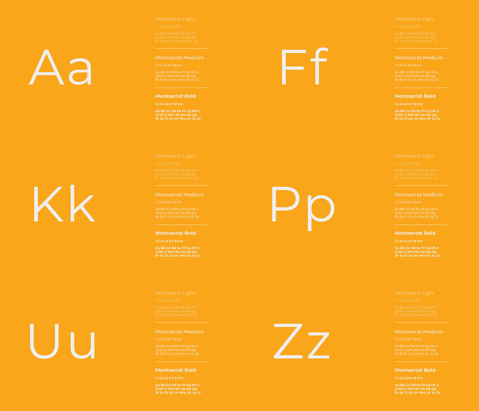
Each design decision, from color to typography, was a step toward building a brand that could stand on its own while still speaking to the intricacies of both sectors.
About
The final logo integrates abstract forms that recall the steel beams and foundations of construction, but with a sleek, modern twist.
Orange was carefully chosen to invoke both the energy of new opportunities and the reliability that clients seek in legal services.








bottom of page